The kitchen is the heart of Stephanie Zubiri-Crespi’s home

‘We’re not big on luxury. I’m big on sentimental value and things that just, you know, “spark joy” as Marie Kondo would say it. Almost everything sparks joy. So I can’t let go of anything.’
Lifestyle journalist, wife and mom of two, Stephanie Zubiri-Crespi welcomes us into her home and shares with us the stories that made it all come together so beautifully.
Philippine STAR: It seems like your kitchen is the heart of your home, would you say that’s correct?
Stephanie Zubiri-Crespi: Definitely. The way I designed it, it really is my dream kitchen—it’s where we live! Every day we wake up, we have breakfast there; when I go home, that’s the first place I go to; and on weekends, my husband and I like to cook, we have our wine, we put some music on, the kids are running around, we’re having a good time. I really wanted a kitchen we could live in. I wanted a big kitchen with an island that I can work in, because I do a lot of cooking demos and videos and so everything had to be beautiful, functional—just a space we can be happy in. It is the place we spend the most time all together.
What layout or flow did you make sure your new kitchen suits your needs and your style?
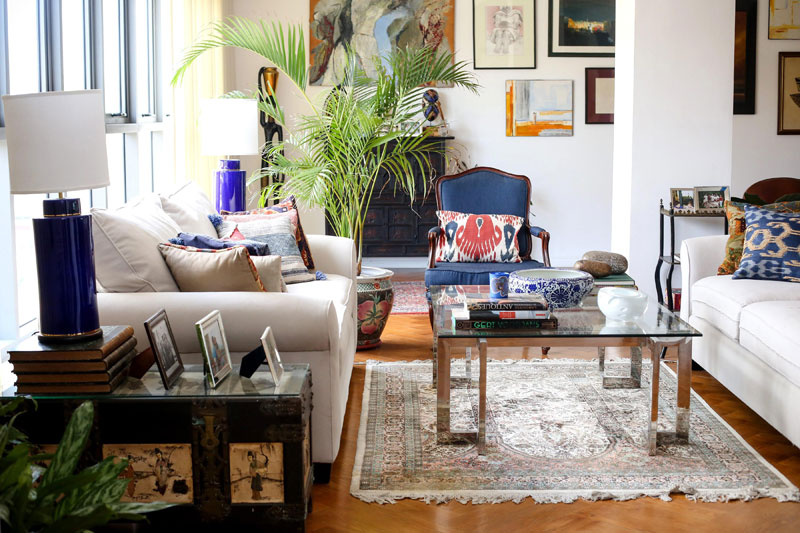
‘‘Everything I have here is pretty much from my old home, because I believe in buying things you’ll never fall out of love with.”
I wanted an island where the stove would be — some kitchens have an island but it’s just a work area. But I really wanted a stove there because when I entertain at home and I have guests and I’m cooking, I always felt like I was pushed to the back and no one could hang out with me while I was cooking because you know, I was facing a wall! So I wanted was kind of like a kitchen stadium. Ha ha! Like a real show kitchen, so that when I had guests, I could see all the way up to the living room. People can hang out with me at the kitchen counter while I would be cooking, have wine and just talk.
Tell us the story of your breakfast nook. What gave you the idea to build this separate area, with colors and a mood that is a bit warmer than the rest of your home?
Well the idea of the whole space was that the kitchen is an integral part of the home. And if you open all the sliding doors in our living and dining area, kitchen, and breakfast nook, it creates one big space. So if you have a party, you have real flow. For the breakfast nook, I wanted to bring in the brick element from outside. It’s a little homage to my restaurant, which had brick walls, blue walls and then a tiled floor. So this space, I see it as my own little private restaurant for friends and family; we also enjoy meals here as a family. We have an area which is the kids’ corner, it has a small table by the window — they love it. We hang out there, I bring my laptop there. I just wanted somewhere warm and a bit more rustic so it doesn’t feel like we’re living in a city. I love brick and what I did was I aged the brick, so that it wasn’t looking brand new. I aged it with some watered down cement. I love the contrast with the blue and white tiles on the floor.
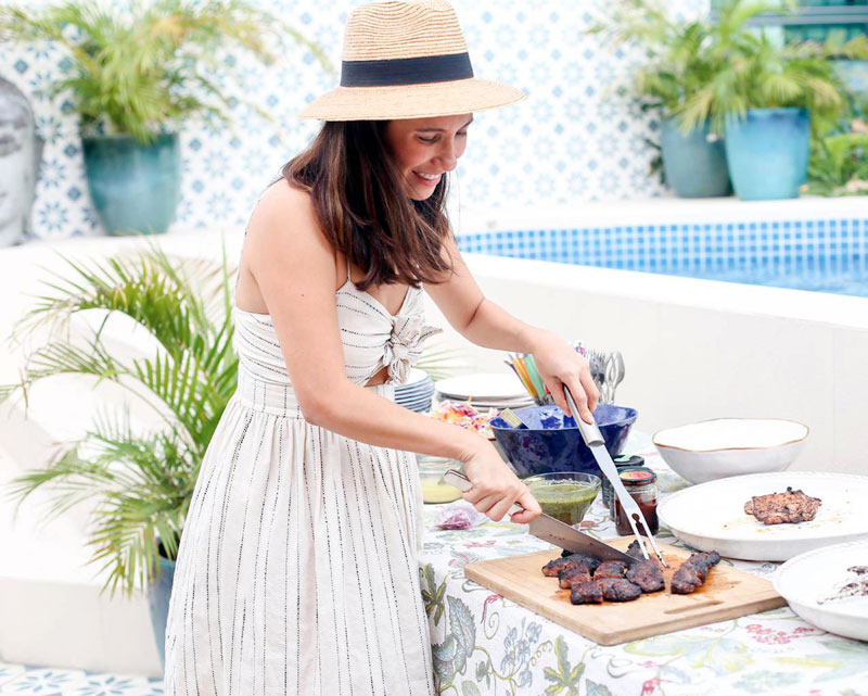
“My outdoor area is like a vacation spot! I got my tiles from Machuca tiles, added a stone-looking tile, bricks, then the plants kind of brought everything together.”
Let’s go to the dining area. Deep blue is an unconventional color for the dining area — why did you decide to go with this shade? Tell us about your beautiful table and chairs.
I love the old-world chic that a deep blue room has. And one of the things a feng shui guy told me before really stuck with me. I used to have a big red painting in my dining room and he said that red is actually aggravating and it shouldn’t be in a dining room, so that you don’t have heated discussions. Since I love blue, I took a risk in my old house and I carried it on here. It’s really a space now for formal dining. The table is custom made by Philux, it’s walnut wood in a special matte finish with a special coating so it doesn’t get scratched easily. The chairs are also by Philux. I love working with them, I love that it’s local, handmade and the quality is excellent. I like the mix that this room has — chinoiserie antique and old paintings with modern art. I love that contrast.
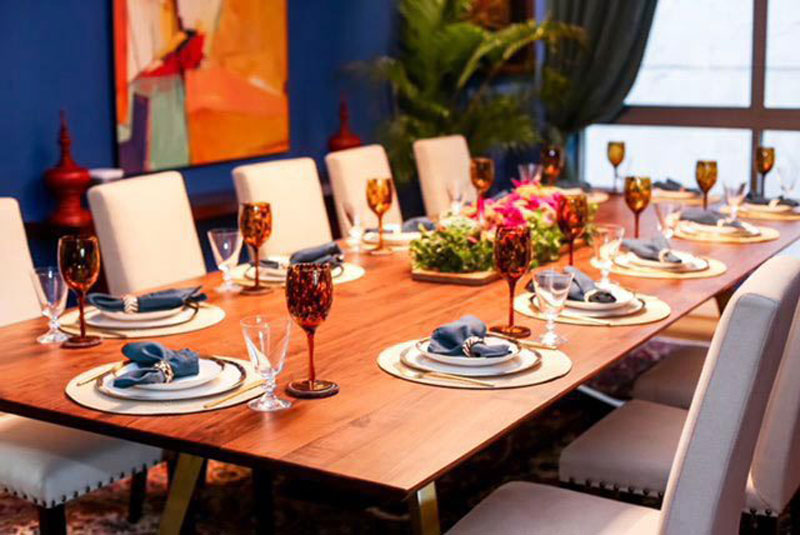
“Definitely a mix of something old, something new, something borrowed, something blue.”
Your living area is full of character! How do you go about mixing and matching the furniture, art, and accessories to make it all go together?
Truth be told, I just buy things that I love and then hope they go well together. It’s very eclectic. I would say it’s a storied life. It’s the things I find in travels, artwork I collected from my parents, artworks we collected in art shows, things we found in markets. The underlying theme here is red and blue. My husband and I, those are the only two colors we don’t fight on, so you will find a lot of those elements. I love mixing old antiques and very ethnic things with a little bit of brass, or a little bit of marble. But that’s layering over many, many years. It took me a good 10 years to get that together!
Did you purchase a lot of new things for this new home, or did you just re-arrange and re-style the existing pieces you had?
I did not purchase a lot of things for this new home. I don’t even think it was 10 pieces. Everything I have here is pretty much from my old home. And that’s because I believe in buying things you really love, you fall in love with, and you’ll never fall out of love with. And I don’t believe in the principle of moving into a new home and completely buying new things. Where’s the history? Where’s the story in that? We really built this home so we could showcase the stuff we love. Someone just said, “did you buy all the artwork?” and I said no, these are all my artworks from my old house, it’s just that this time, we invested in nicer lighting. You know, special lighting for the paintings that really make them more beautiful. We’re not big on luxury. I’m big on sentimental value and things that just, you know, “spark joy” as Marie Kondo would say it. Almost everything sparks joy. So I can’t let go of anything.
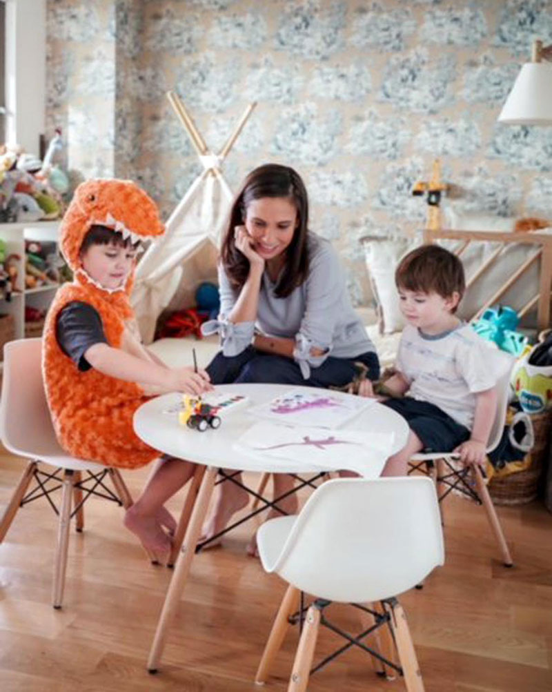
Steph with sons Sebastian and Max
Your outdoor area is like a vacation spot! I know you have a thing for tiles. Tell us about what went into choosing the prints and textures for this space.
My outdoor area is like a vacation spot! I got my tiles from Machuca Tiles. I chose the color and the design. Basically, I told my husband, “I’m sorry you have no say in this. I want my boho blue tiles. Just give it to me please?” And in the end he was really, really happy. I chose a nice off-white, sort of stone looking tile and we covered the outdoor area in brick, so it really added warmth to the blue and white. Then all the plants kind of brought everything together.
What was the biggest lesson you learned from building this new home?
Spend on the things that matter. These are the things that are difficult to change—flooring, good tiles, good bathroom fixtures. And then everything else, all the loose furniture, the artwork, they can come later on. And here’s a little tip for you guys, building a home or decorating a home or renovating a home with your spouse is extremely difficult. You will get into a lot of fights. But my husband and I survived it all with a little rule. Each of one of us gets a full veto. Meaning, if we don’t like something that the other one likes, then we say “veto” and they cannot argue, and vice-versa. If it’s a “maybe” then you can argue. But if it’s a full veto and they veto, just drop the issue and move on and try to find other solutions. That really, really helped us. We’re just really happy to be here, and I can’t wait to see how our house will grow and unfold and add more wonderful things to our collections.


