


An iconic beauty gets a facelift
MANILA, Philippines — Logos do not maketh the brand in the digital age. Case in point: The beauty brand La Prairie has become synonymous with its emblematic cobalt blue with a campaign that touches on the arts and science. No beauty fan worth their retinol would be able to think of any other brand besides La Prairie when you say caviar, from which it sources its proprietary anti-aging ingredient. And yet, the importance of logos still endures.
“Our logo is the reflection of La Prairie’s soul. It embraces the values and the heritage of the House; it expresses its singular identity to the world. It represents who we are, and who we will be tomorrow,” explains Greg Prodromides, chief marketing officer of La Prairie.
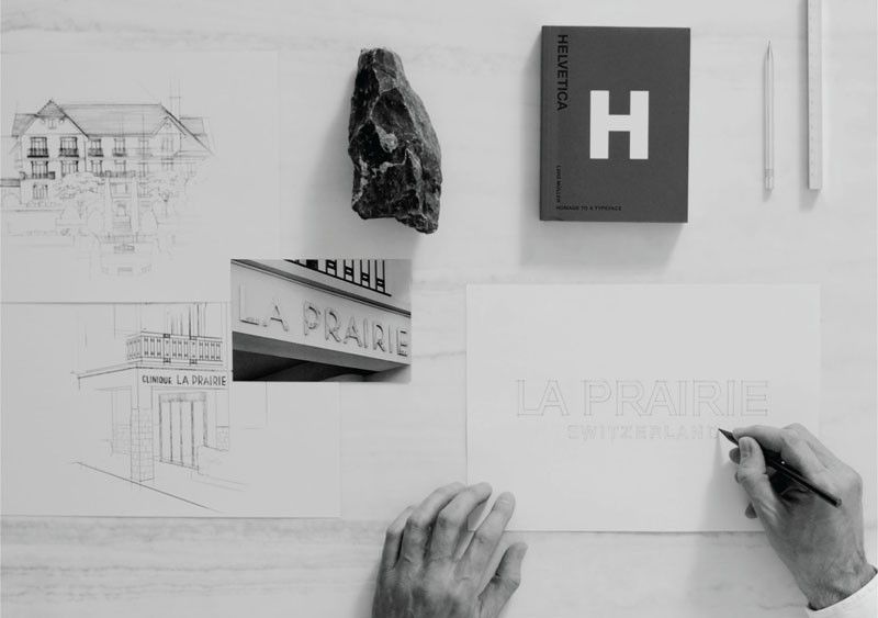
In the 1970s, the La Prairie logo was designed using a typography called Helvetica. Today, Helvetica is known as Helvetica Neue, and it is more than simply a font. Created in 1960 in Zürich by typeface designer Max Miedinger, the font is a symbol of cutting-edge Swiss design, a masterpiece to which museums dedicate exhibitions all around the world, and a documentary seen by design lovers of every type in 2007.
The new La Prairie logo takes inspiration from the font Helvetica Neue, shifting from lowercase to all caps. It’s a 21st century answer to the digital world we live in. The world’s most beloved typeface registers better in any browsing platform or device, including small ones like smartphones and watches.
“Naturally, as the world and our House evolve, we felt it was the right time to reimagine our logo. Untouched for almost 50 years, this new logo represents a key milestone in the story of our brand. It is a way for us to celebrate our past, while continuously looking at our future ahead,” adds Greg.
La Prairie’s new logo is inspired by the sign on the door of the Clinique La Prairie of the 1930s. It was designed using an original typography inspired by the Art Deco movement that was the leading aesthetic of that avant-garde period. In fact, in Montreux, some of these iconic Art Deco signs still exist today.
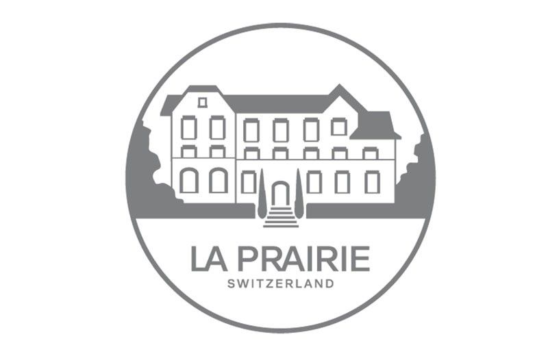
The reinvented logo is accompanied by a new signature seal — both to be rolled-out across the La Prairie products and point of sales in the coming months, beginning with its upcoming brand communication campaign “Hold Time in Your Hands.” It will debut on Jan. 25.
***
In the Philippines, La Prairie is available exclusively at Rustan’s. Shop at Rustan’s Makati, Shangri-La Plaza Mall, and Cebu, or online at rustans.com.


